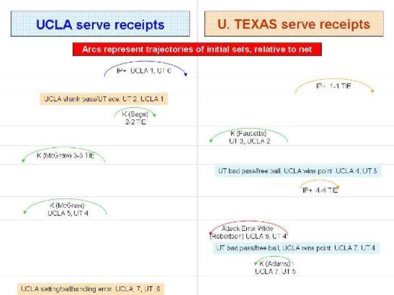
Being able to check, at a glance, whether a team was varying its attacks between high and outside (a "4 set"), quick middle hits (a "1 set"), and other varieties of plays, and its success in siding-out with the various types of attacks, would seem to be valuable information. Further, because the webcast was shown entirely from an "end zone" camera, it was relatively easy to observe the arcs of the sets.
What I didn't bargain for was that, even graphing merely a single game (Game 2, which ended up being the only one taken by the Bruins), the process of manually creating the following PowerPoint slides from my original written notes and verifying them as best as I could against the conventional play-by-play sheet consumed several hours over the next few nights. If there is to be a future for this type of diagram -- and I'm eager to see if people think there should be -- we have to hope that someone creates special software for this purpose.
Before discussing the diagram (which actually consists of four stacked images, due to space limitations for any one image), some limitations must be acknowledged: (1) only the teams' plays directly off of serve receipt are shown, not any sets from continuing rallies; (2) the arcs and ultimate results of each play are based on my handwritten notes taken live, as there did not appear to be a way to save a file of the completed video to watch it multiple times; and (3) as a result of the second limitation, I just plain missed some serves (for example, I may have still been writing from the previous play).
OK, here are the diagrams. I would urge readers to click on each frame to enlarge it. The rectangles at the top for each team are meant to symbolize a net, relative to which the arcs of the sets can be seen. The camera was behind UCLA's end, so the charts for the Bruins are a direct reproduction of my hand drawings. For the Longhorns, I initially drew the arcs as they appeared to me and later flipped them horizontally to reflect how they would look from the UT side of the net.


Unfortunately, conclusions and inferences are limited by having a record of just one game. Manual production of such diagrams for three or more games per match, even aided by the copy-and-paste functions, would be prohibitively time-consuming. Here's hoping that someone comes up with a way for an observer to enter minimal raw data into a software package that can generate visual diagrams similar to (or even better than) the ones above.
UPDATE: In response to a note I put on VolleyTalk about this posting, one of the discussants suggested DataVolley as a software program for recording and plotting information from volleyball matches. There apparently is a free version one can download, as well as more elaborate versions for purchase.

No comments:
Post a Comment